Every capstone so far compared groups. This one asks a different shape of question: as one number goes up, does the other go up too, and how reliably? Correlation answers that in a single coefficient, which is its great convenience and its great danger, because one number can hide a great deal.
- Setting
- A survey recorded each student's self-reported weekly study hours alongside their final exam score.
- The question
- How strongly do study hours and exam performance move together?
- Why it matters
- Study advice given to students rests on the answer, and the leap from "moves together" to "study more and you will score higher" is exactly the one this design cannot support.
- What we do
- Plot before computing anything, measure Pearson's correlation, decompose it back to the covariance underneath, show three very different datasets that all produce the same r, and compare two intervals that disagree.
Study hours and exam scores are positively related: r = 0.48, p < 0.001, 95% CI [0.31, 0.63], so hours account for about 23% of the variation in scores. But one student out of 90 moves that number from 0.68 to 0.48, and the design cannot tell us whether studying causes the scores or the other way round.
The Question and the Design
A survey recorded each student's self-reported weekly study hours alongside their final exam score. Both variables are continuous and measured on the same people, which is the setting for Pearson's correlation, provided the relationship is roughly linear.
| Framework step | This project |
|---|---|
| Goal | Measure how strongly weekly study hours and final exam score move together. |
| Hypotheses | H₀: the true correlation is zero vs H₁: it is not. Two-sided, α = 0.05. |
| Data type | Two continuous variables on the same students. |
| Design | Observational and cross-sectional. No randomization, no time ordering. |
That last row is the one to remember. It is the weakest design in this part for causal claims, and it is also by far the most common design in real analysis.
Look at the Scatterplot Before Computing Anything
Cleaning removed one duplicate row, two students with a missing score, and one impossible entry of −2 study hours, leaving 90 students. Then, before any coefficient, the plot.
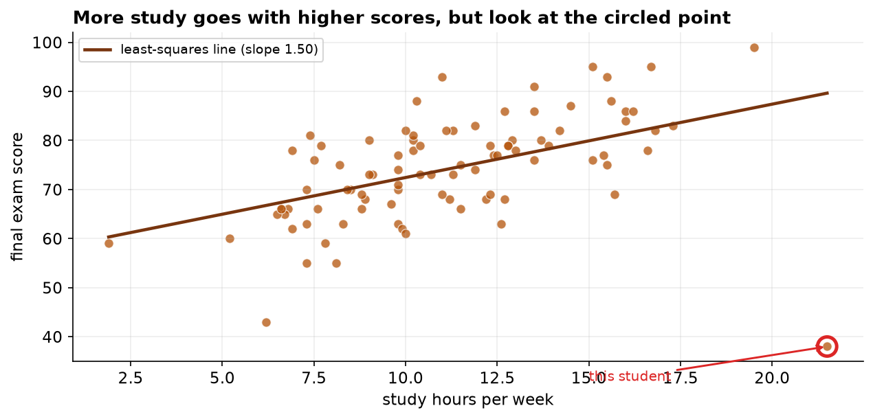
A correlation coefficient is a single number summarizing a whole cloud, and very different clouds can produce the same number. The scatterplot is what tells you whether the relationship is linear (so that Pearson is the right tool at all), whether it curves (which would understate the true association), and whether one point is steering the result. Computing r without plotting is how analysts publish numbers they cannot defend.
The Correlation, and How Much It Explains
The relationship is real: the interval for r runs from 0.31 to 0.63 and does not come near zero. But r² is the number worth putting in front of a student. Study hours account for about 23% of the variation in exam scores, which means roughly three quarters of the difference between students is not explained by hours studied. Both halves of that sentence are true and the second half is the one usually left out.
One Student, Two Different Answers
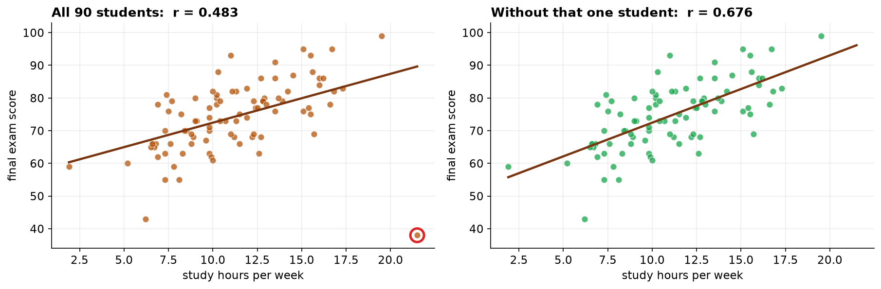
Now the stability check that most correlation analyses skip. What happens if we recompute r without that one unusual student?
| Measure | Value | What it tells us |
|---|---|---|
| Pearson r (all 90) | 0.483 | the reported result |
| Pearson r (without that student) | 0.676 | moves by +0.19, a large shift for one point |
| Spearman ρ (all 90) | 0.613 | rank-based, so much less disturbed by the outlier |
Notice that Spearman's rank correlation is 0.613, sitting much closer to the without-the-point value. Ranks care only that the student scored low, not how far below the line they fell, so the rank method is largely unmoved by exactly the observation that drags Pearson down.
Not delete it. That student is real data, not a recording error, and quietly dropping inconvenient points to strengthen a result is data manipulation. The correct handling is to report r with the point included and to disclose how much rests on it, which is what the table above does. A reader can then judge for themselves.
Three Worlds That All Produce r = 0.48
The correlation is a statement about co-movement, and at least three quite different realities would produce it.
The third diagram is the one that catches people. If prior preparation or motivation drives both variables, hours and scores would correlate even with no direct link at all between them. And no amount of extra data fixes this: it is a limitation of the design, not of the sample size.
The Verdict and Its Limits
Study hours and exam scores are positively and significantly associated, and hours account for roughly a quarter of the variation in scores. That is a genuine and useful finding, provided it is stated as an association and not as a recipe.
- Self-reported hours are optimistic. People overestimate study time, and probably not uniformly: if weaker students over-report more, the measurement error sits in the predictor and biases r toward zero. The true association may be somewhat stronger than 0.48.
- Do not convert r into advice. "Study five more hours to gain ten points" reads a causal slope off a correlational design. The defensible version is that more study is associated with better scores on average, with wide variation between individuals.
- One student carries a lot of the answer. Report r with them included and disclose the influence, as Section 4 does.
- Restricted range. These are students who enrolled and sat the exam. Among a wider population, including those who withdrew, the relationship could look quite different.
Correlation in Data Science & AI
Correlation is probably the most-computed statistic in applied data work, and the most casually misread.
| Where it appears | What is being correlated |
|---|---|
| Feature screening | Each candidate predictor against the target, before modeling. |
| Multicollinearity checks | Predictors against each other, to find redundant features. |
| Correlation heatmaps | Every pair at once, as in the dashboard of Capstone 4. |
| Metric validation | A cheap proxy metric against the expensive ground-truth measure. |
A correlation heatmap computes hundreds of coefficients and plots not one scatter, which means every warning in this chapter, non-linearity, influential points, restricted range, is invisible by construction. Anscombe's quartet is the classic demonstration: four datasets with identical means, variances, and correlations that look completely different when plotted. Screen with the heatmap if you must, but plot anything you intend to act on.
Where the Correlation Comes From: Covariance
Pearson's r arrived from a library call. It is worth opening it up once, because r is not a primitive quantity. It is covariance with the units divided out, and seeing that explains both why r has no units and why it cannot leave the range from −1 to +1.
| How the variables happen to be coded | Covariance | Pearson r |
|---|---|---|
| hours, points (as recorded) | 17.9 | 0.483 |
| minutes, points | 1,076.4 | 0.483 |
| hours, score out of 1000 | 179.4 | 0.483 |
| minutes, score out of 1000 | 10,763.7 | 0.483 |
The relationship never changed across those four rows; only the bookkeeping did. The covariance ranges over four orders of magnitude while r sits still. Chapter 89 develops this; the point of repeating it here is that the correlation you report is a rescaled covariance, and knowing that is what makes the coefficient interpretable rather than magic.
Two Intervals for r, and They Disagree
| Quantity | Estimate | 95% confidence interval |
|---|---|---|
| Pearson r, Fisher z formula | 0.483 | 0.307 to 0.628 |
| Pearson r, bootstrap | 0.483 | 0.126 to 0.750 |
| r-squared, bootstrap | 0.234 | 0.016 to 0.563 |
| Spearman's rho, bootstrap | 0.613 | 0.433 to 0.754 |
| r without the influential student | 0.676 | 0.555 to 0.773 |
Fisher's formula gives 0.31 to 0.63. The bootstrap, which assumes nothing, gives a far wider 0.13 to 0.75. That gap is not a bug; it is the influential student showing up again. Fisher's interval is derived assuming the two variables are bivariate normal with no high-leverage points, and this sample has one. A parametric interval that disagrees with a bootstrap is usually telling you an assumption is not holding, and here the bootstrap is the one to report.
The consequence for the headline is real. The share of variation explained runs from a few percent to over half. "About a quarter, and do not lean on it" is a fair reading of that; "23.4 percent" is not.
The full project, step by step
The companion notebook works the framework end to end: it cleans the survey with a printed audit trail, plots the scatter and flags the most influential point before computing anything, checks the assumptions, computes Pearson's r with a Fisher-z confidence interval and r², then refits without the influential student and compares against Spearman's rank correlation to show how much the answer depends on one observation. Every number here comes from its output, with a plain-language note after each result.
The dataset (capstone-study-hours-and-scores.xlsx) holds one
row per student on the students sheet, with the duplicate, the blanks, and the impossible negative entry
left in so you can practice the cleaning, and the influential student left in because they are real. Two written
reports accompany it: a plain-language brief for a course leader, and a technical
report with the influence analysis, intervals, and references.
🎓 Key Takeaways
- ✓Plot before you compute: a correlation is one number summarizing a whole cloud, and very different clouds give the same number.
- ✓Report r², not just r: r = 0.48 means hours explain about 23% of score variation, so roughly three quarters is something else.
- ✓Test the result's stability: one student out of 90 moved r from 0.68 to 0.48. Disclose that; do not delete the student.
- ✓Ranks resist outliers: Spearman's ρ = 0.61 barely noticed the point that pulled Pearson down by 0.19.
- ✓Three causal stories fit one r: hours cause scores, scores cause hours, or a third variable causes both. Only design can separate them, never a larger sample.
Quiz: Test Yourself
Eight questions on this capstone, from the scatterplot to the confounder. Answer them, hit Check Answers, and keep refining until you score 100%. Your progress is saved.