How People Travel Tracks Where They Live
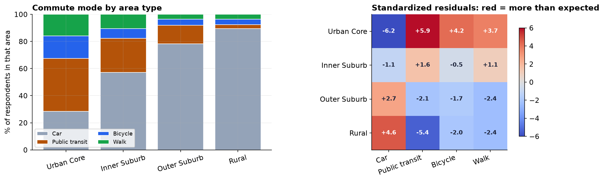
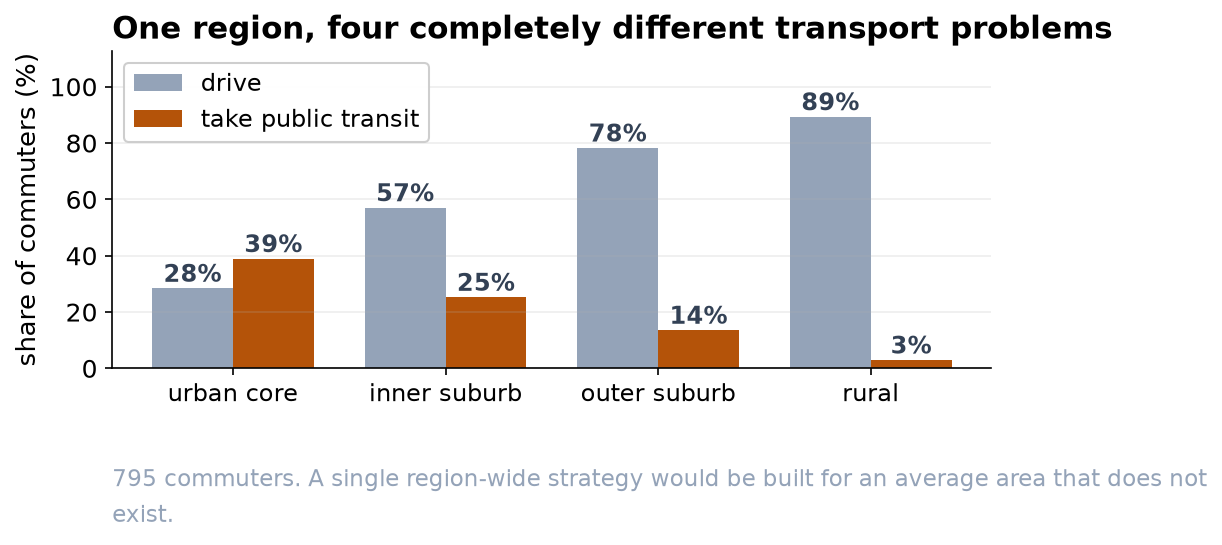
Public transit falls from 39 percent in the urban core to 3 percent in rural areas; car use runs the other way.
Recommendation
Stop planning for the region as one place. Commute mode is strongly tied to area type: in the urban core 39% take public transit and 28% drive, while in rural areas 89% drive and only 3% take transit. A single region-wide transport strategy would fit none of these four areas well. Target investment by area type.
What we found
We surveyed 795 residents across four area types and cross-tabulated where they live against how they mainly travel. The relationship is unmistakable and highly unlikely to be chance. More usefully, it is an orderly gradient rather than a scattered pattern: as areas get less dense, transit use falls steadily and car use rises steadily, with the two suburban bands sitting neatly in between.
Where the effect actually sits
Cycling and walking barely move across the four areas. The whole relationship is carried by cars and public transit, at the two extremes of density. That is a practical steer: the lever worth pulling in rural areas is not a bike lane, and the lever worth pulling in the urban core is not a car park.
One number you should not quote
The survey deliberately sampled 200 residents from each area, so every area is measured with the same precision. That design makes comparisons between areas fair, but it also means this sample does not mirror how the population is actually distributed. Any headline of the form 'X percent of residents in the region take the bus' computed from this file would be misleading. Comparing areas is what the survey was built for; producing a single regional total would require weighting each area by its real population first.
A caution on interpretation
Rural residents drive more, but this survey cannot tell us whether that is preference or lack of an alternative. If there is no bus, the answer 'car' is a constraint, not a choice. The finding tells us where to look; it does not tell us that rural residents would reject better transit if it existed. Answering that needs a different question on a future questionnaire.