A retention campaign reduced churn by a genuine, well-measured 5.7 percentage points and lost 159,000 dollars doing it. Nothing was wrong with the model. The list was sorted by the wrong thing.
- Setting
- One quarter of subscriber records from a meal-kit company: 23,641 accounts with tenure, order behavior, delivery quality, support contacts, ratings and app activity, plus the outcome of a randomized retention campaign.
- The question
- Who should be sent the offer next quarter? Not who is likely to cancel. Who will do something different because we contacted them.
- Why it matters
- A retained subscriber is worth 290 dollars of margin. The offer costs 30 dollars per account it is sent to, whether or not that subscriber was ever going to leave. Divide the two and the offer only pays for itself on somebody whose chance of canceling it lowers by more than 10.3 points.
- What we do
- Check the randomization, price the campaign as it was run, hold a three-model bake-off that turns out not to matter, use SHAP and LIME carefully enough to see what they do and do not claim, then fit an uplift model and compare two targeting rules on money rather than on accuracy.
Three model families land within 0.0009 of each other on AUC. Switching between them is worth almost nothing. Switching from a risk-ranked list to an uplift-ranked list is worth 376,000 dollars a year, and the highest-risk segment in the whole dataset, which cancels at 49 percent, loses money when you contact it.
Two Numbers Decide Everything
The retention team supplied both before any modeling started. A subscriber who stays is worth $290 of gross margin over the following year. The offer, 20 percent off the next three boxes, costs $30 per account it is sent to.
The credit lands on the account whether or not the subscriber was ever going to leave. So the $30 is a cost of targeting, not a cost of saving. Divide it by the $290 and you get the number the entire project turns on:
break-even uplift = 30 ÷ 290 = 10.3 percentage points
Contacting somebody is worth doing only if it lowers their chance of canceling by more than 10.3 points. Not if they are likely to cancel. If it changes whether they cancel.
That sentence quietly rules out the standard approach. A churn model estimates the first quantity and says nothing at all about the second.
Price What Already Happened
The campaign was randomized: half of all active subscribers, chosen by a coin flip on the account number, were sent the offer. Balance across the two arms is clean, with a largest standardized difference of 0.018 against a conventional threshold of 0.10. So the difference in churn between the arms is the causal effect of the offer, and no model is needed to read it.
The campaign worked and lost money. Both halves of that sentence are true and neither is a criticism of the offer. It really did reduce churn, by an amount whose confidence interval is nowhere near zero. It is simply that 5.7 points of avoided churn buys $16.66 of margin, and the offer costs $30.
So the campaign does not need a better model or a better discount. It needs to be sent to fewer people, and the entire question is which ones.
The Bake-Off That Does Not Matter
The risk model answers "what is the chance this subscriber cancels if we do nothing", so it is fitted on the control arm only. Three families, same features, same split.
| Model | ROC-AUC | PR-AUC | Brier |
|---|---|---|---|
| Logistic regression | 0.8137 | 0.6130 | 0.13132 |
| Random forest | 0.8146 | 0.6189 | 0.13390 |
| Gradient boosting | 0.8145 | 0.6169 | 0.13056 |
A spread of 0.0009 in ROC-AUC across three quite different model families. There is nothing to choose between them, and a reasonable person would take the logistic regression for its transparency and stop.
Hold that thought. Model selection is where a great deal of project time goes, and by the end of this chapter a different decision will be worth a six-figure sum. It is not this one.
What a SHAP Importance Actually Measures
SHAP on the winning model gives a clean global ranking: tenure first, last rating second, skipped weeks third, delivery issues fourth. Support contacts sit near the bottom, tenth of nineteen.
Now remove one column, delivery_issues_90d, and refit.
Nothing changed about how much support contacts matter to a subscriber. What changed is what they add, and that is what a SHAP importance measures. Support calls are largely caused by delivery failures; with the delivery column present there is little left for them to explain, and with it gone they stand in for it.
An importance ranking is a statement about this model with these columns. Add one, drop one, and it moves.
A high-ranking feature is not a lever. Read the second ranking and decide to reduce support contacts, and the cheapest way to do that is to make support harder to reach. The feature moves. The delivery failures stay exactly where they are.
SHAP and LIME, on the Same Subscriber
Both methods explain one prediction by assigning a contribution to each feature, and they are built on different ideas. SHAP allocates the prediction with a rule borrowed from cooperative game theory. LIME fits a simple local model to points sampled around the one you asked about. Nothing guarantees they agree, and on sixty mid-risk subscribers they name a different single most important driver 52 percent of the time.
| One subscriber: 7 months, 2 delivery issues, 3 skipped weeks, rated 4, signed up on a discount | |
|---|---|
| SHAP says | LIME says |
| delivery issues +0.617 | tenure months +0.144 |
| autopay +0.359 | delivery issues +0.135 |
| app logins −0.291 | signup discount +0.064 |
| skipped weeks +0.267 | autopay +0.063 |
They agree this subscriber is at risk and they disagree about what to put at the top of the retention agent's screen. Neither is wrong. They answer slightly different questions, and both are descriptions of the model rather than of the subscriber.
That is the honest framing for a business audience: this is what the model responds to, not this is why the customer is leaving. The distance between those two sentences is the rest of this chapter.
The Question Nobody Asked the Model
Every number so far has been about who cancels. The offer only earns its $30 from people whose behavior it changes. Because the campaign was randomized we can estimate that directly: fit one model on the control arm and one on the offered arm, and the gap between their predictions is the estimated effect of the offer on that subscriber. This is the two-model, or T-learner, approach.
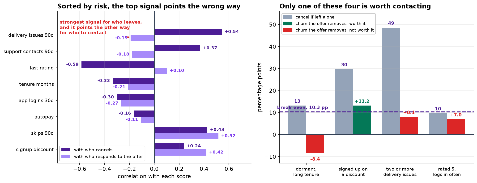
Read the last two chips together. delivery_issues_90d is the clearest signal in the dataset
for who cancels, and it points the other way for who to contact. That is not a quirk of the model. A
subscriber whose boxes keep arriving late has a service problem, and 20 percent off the next three does not fix
a service problem. Meanwhile signup_discount, sixth in the risk ranking, is the strongest single
predictor of who responds.
Two Targeting Rules, Priced
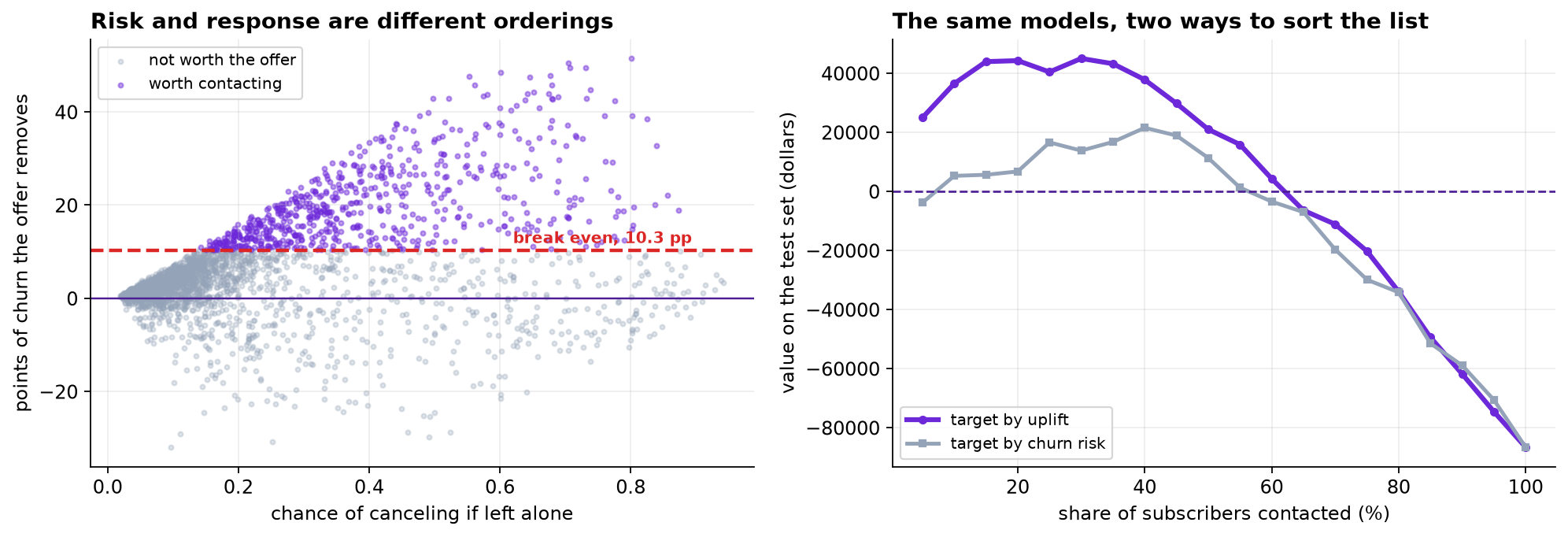
A targeting rule picks a set of accounts using features only. Because assignment was random, the offered and control accounts inside any such set are still comparable, so the value of a rule can be measured rather than modeled.
| Contact the top | Ranked by churn risk | Ranked by uplift | ||
|---|---|---|---|---|
| churn avoided | value | churn avoided | value | |
| 10% | 12.53 pp | $5,244 | 25.55 pp | $36,499 |
| 20% | 11.75 pp | $6,735 | 19.57 pp | $44,261 |
| 30% | 12.26 pp | $13,788 | 16.59 pp | $44,990 |
| 40% | 12.59 pp | $21,519 | 14.28 pp | $37,794 |
| 50% | 11.29 pp | $11,320 | 12.09 pp | $20,989 |
| 70% | 9.17 pp | −$19,679 | 9.68 pp | −$11,138 |
| everybody | 6.73 pp | −$86,636 | 6.73 pp | −$86,636 |
Read the bottom row first: contacting everybody, which is what the campaign did, loses money on the test set, exactly as section 2 said it would. Then read across. At every depth the uplift ranking is worth more, and at the top of the list it is worth seven times more.
Same data, same features, same model family, same three-model bake-off that made no difference. The only thing that changed is what the list is sorted by.
Four Segments, Four Different Answers
Quartiles of a model score are hard to hand to an operations team. These four groups can be written down in a spreadsheet, and each one is still a randomized comparison, so each number below is measured against its own control.
| Segment | n | Cancel if left alone | Churn the offer removes | Value per account |
|---|---|---|---|---|
| Dormant: long tenure, autopay, rarely logs in | 537 | 13.2% | −8.40 pp [−14.80, −2.01] | −$54.37 |
| Signed up on a discount | 3,409 | 29.8% | +13.16 pp [+10.36, +15.97] | +$8.17 |
| Two or more delivery issues | 1,321 | 48.6% | +8.09 pp [+2.73, +13.45] | −$6.54 |
| Rated 5, logs in regularly | 1,509 | 9.7% | +6.97 pp [+4.54, +9.39] | −$9.80 |
The dormant group is the one to look at twice. Long tenure, on autopay, barely opens the app. They cancel less than anybody in the table, and sending them the offer made them more likely to leave, by 8.4 points, with an interval that does not include zero. The most likely explanation is the least sophisticated one: an email about a subscription is a reminder that the subscription exists. Every dormant account that was sent the offer cost about $54.
The delivery-issues group is the trap. They cancel at nearly 49 percent, which puts them at the very top of any risk-ranked list, and targeting them still loses about $6.50 an account. The offer does move them, by 8.1 points, and 8.1 is below 10.3.
The discount signups are the business case. They came in on a promotion, they skip weeks, they respond to a price. Nearly all of the recoverable value in this campaign is in this one group.
What to Watch
- ✓Ask what the decision is before choosing the target variable. "Who will cancel" and "who should we contact" produce different models, and only one of them answers the question that has a budget attached.
- ✓Price the intervention first. The break-even of 10.3 points was computable before any data was loaded, and it turns the whole project from a modeling exercise into an arithmetic one.
- ✓Feature importance is a property of the model. Drop a correlated column and a feature can move five places while the model gets no worse.
- ✓Explanations describe the model, not the world. SHAP and LIME disagreed on the top driver for half the subscribers, and neither was making a causal claim.
- ✓Uplift needs an experiment. None of this was available without a randomized holdout. A retention team that offers to everybody has no way to learn who was worth offering to.
- ✓Keep the holdout permanently. Not as a one-off study. It is the only instrument that measures whether the program still works.
- ✓Some contact does harm. The dormant finding is a subgroup result with a wide interval, and it is exactly the kind of result to confirm with a small test rather than to build into a permanent exclusion rule.
Uplift and Explainability in Data Science & AI
| Where it appears | The same distinction, in a different costume |
|---|---|
| Marketing and CRM | Who buys against who buys because of the ad. The whole field of incrementality testing exists because the two get confused |
| Medicine | Prognosis against treatment effect. A patient at high risk of a bad outcome is not automatically the patient a drug helps most |
| Credit and collections | Who defaults against who responds to a payment plan, and the same trap: the highest-risk accounts often respond least |
| Public programs | Who is most in need against who is most helped, which is a values question as much as a statistical one |
| Recommendation systems | What a user would have watched anyway against what the recommendation changed, the difference between a score and a lift |
The four-way split used in section 8, persuadables, lost causes, sure things and sleeping dogs, comes from Radcliffe and Surry, who built the practical uplift literature out of direct-mail work in the 1990s and named the Qini curve. Rzepakowski and Jaroszewicz gave uplift decision trees their splitting criteria, and Künzel and colleagues set out the S-, T- and X-learner meta-learner family, of which the two-model approach used here is the simplest member. Athey and Imbens connected all of this to causal inference proper with causal forests and honest estimation. On the explanation side, Ribeiro and colleagues introduced LIME in 2016 and Lundberg and Lee introduced SHAP in 2017; Rudin argues that for high-stakes decisions the right response to both is to fit an interpretable model in the first place, which given the bake-off in section 3 is not an unreasonable position here.
The full project, step by step
The companion notebook computes the break-even before loading anything, cleans three faults out of the export, checks the randomization, prices the campaign as run, holds the bake-off, runs SHAP with and without a correlated column, puts SHAP and LIME side by side on the same subscriber, fits the T-learner, prices both targeting rules across every depth, and measures the four segments against their own controls.
The dataset
(capstone-churn-prediction-explainability.xlsx) holds 24,380 subscriber records with a duplicated
export block, a rating column that codes "never rated" as −1, accounts too new to have churned, the
randomized campaign flag, and the agreed economics. Two written reports accompany it: a
plain-language brief for the retention lead, and a technical report covering
the bake-off, the explanation methods and the uplift evaluation.
🎓 Key Takeaways
- ✓The campaign worked and lost money. A real 5.7-point reduction in churn, against a break-even of 10.3, is $158,998 gone.
- ✓Three model families, 0.0009 of AUC between them. The bake-off was the least consequential decision in the project.
- ✓A feature moved five places when a correlated column was dropped, and the model got no worse. Importance is a property of the model.
- ✓Risk and uplift correlate at 0.34. Sorting by the second was worth $376,046 a year over sorting by the first.
- ✓The 49-percent-churn segment loses money when contacted, and one segment is made worse by being contacted at all.